
Choose direct embroidery when a simple logo can stay clear on the finished plush surface. Consider a sewn-in woven label when a full brand name needs a separate reading area or you want to keep the character’s face and body free of branding. Approve either option at its actual finished size, in its final position. A large artwork preview cannot show how lettering will read through plush fibers, around a stuffed head, or beside a seam.
Here, “woven label” means a separate textile label with the design woven into it and sewn into the plush construction. The useful comparison is between that attached label and a logo embroidered directly onto a plush panel.
Which option fits your logo and character?
Start with what the buyer must recognize: a symbol, a short name, or the complete wordmark. Then choose a location that gives that artwork enough space.
| Decision point | Direct embroidery | Sewn-in woven label |
|---|---|---|
| Brand presence | Places the mark directly on the character. Check that it works with the face, outfit, and silhouette. | Gives branding a separate surface. Check whether the tab is visible enough in the intended hanging position. |
| Small lettering | Assess the actual stitch-out on the chosen fabric, including letter openings and spacing. | Assess the woven proof within the exposed area. Tiny text can still lose definition. |
| Surface and shape | Plush pile, stretch, seams, and curvature all need review. | The logo has its own textile surface, but the attached label can turn, bend, or disappear behind the plush. |
| Available space | Use the unobstructed panel area after assembly, rather than the toy’s overall height. | Use the visible face after folding and sewing, rather than the full flat label dimensions. |
| Feel | Handle the decorated area and check whether its firmness suits the rest of the plush. | Handle the edges, fold, and attachment area; check whether the projecting tab feels right. |
| Approval evidence | A finished-size stitch-out plus the assembled, stuffed sample. | A finished-size woven proof plus the label sewn into the intended seam. |
If your logo only works after an unapproved font change or abbreviation, pause. Ask the brand owner to approve a small-format version, or assess another location. Neither technique guarantees that a complex wordmark will fit a tiny space.
Check the logo at actual size before sampling
Specify the logo’s width and height in millimeters. Also mark the available branding area on the plush drawing. A toy’s total height does not tell the manufacturer how much clear space remains between its eyes, ears, hair, clothing, and seams. Use the plush keychain size specification guide to define the body and attachment measurements separately.
Print the proposed logo at its stated dimensions, measure the print with a ruler, and place it on a full-size character outline. Disable “fit to page.” A screen shown at 100% zoom is not necessarily displaying the artwork at physical size.
This paper check helps you reject an obviously crowded layout. It cannot establish stitch quality or woven detail. For those decisions, request a physical proof using the intended method and materials.
- Read the name without prompting. Ask someone who has not been studying the artwork to read it at the intended viewing distance.
- Inspect the difficult parts. Look at narrow letter gaps, enclosed spaces in letters, fine outlines, and adjacent colors.
- Keep the correct version. Identify any permitted simplification, including removed taglines or a symbol-only alternative.
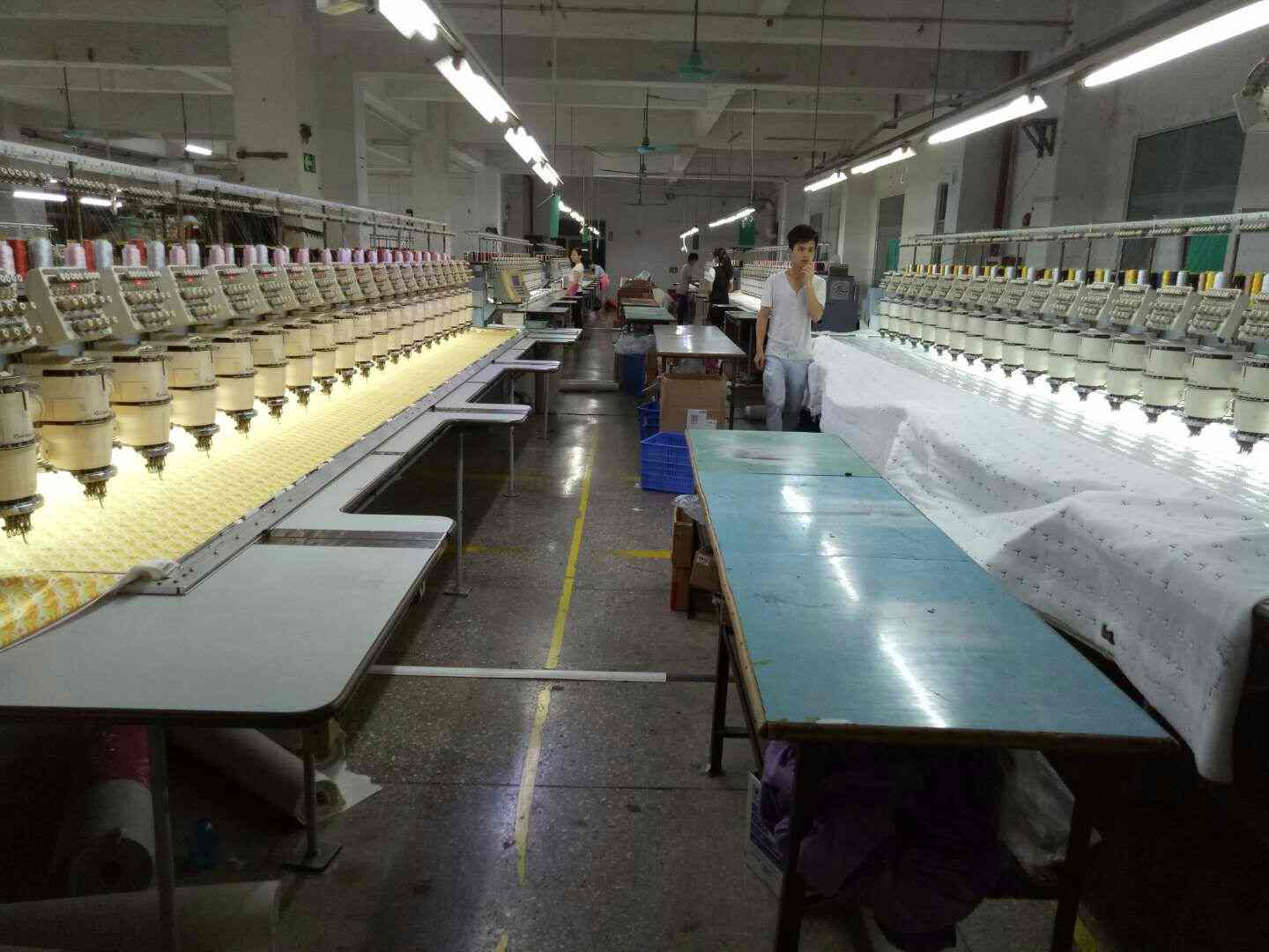
What can make embroidery hard to read on plush?
Pile can cover fine details
The raised fibers of a plush fabric can interfere with small lettering. Madeira’s embroidery topping guidance explains that toppings help keep stitches from sinking into textured, high-pile surfaces. That establishes why surface texture matters; it does not establish a suitable process for every plush design.
Ask for a stitch-out on the proposed fabric, in the proposed pile direction. Review it after the normal finishing process, without a temporary topping making the surface look cleaner than the delivered product. Move the fibers gently in both directions and see whether the logo remains identifiable.
The embroidery file must suit the fabric
A vector logo is an artwork reference, not a complete stitch plan. Wilcom’s production-ready lettering guidance identifies fabric-specific settings such as density, underlay, and pull compensation. Its pull compensation documentation also describes how stitching can draw fabric inward and distort outlines.
For a buyer, the useful question is: “Does this logo read clearly on our selected material at this size?” A universal minimum letter height or stitch count cannot answer that for every font, thread, fabric, and construction. Request the proposed dimensions and a proof instead of accepting a general promise that “small text is possible.”
Assembly can change the way the logo looks
A flat stitch-out is only one approval stage. On the assembled plush, a logo may wrap around a rounded head, lean toward a seam, or become partly hidden by an ear or sleeve. This is why our recommendation is to review both the decorated panel and the stuffed sample.
Mark placement from an identifiable reference, such as the finished center seam or the centerline of a body panel. State whether measurements follow the curved surface or are taken straight across. Agree on the relevant placement tolerance rather than leaving “centered” open to interpretation.
If the best location is a shirt or other garment, check it with the clothing fitted to the plush. The mascot clothing specification guide can help you describe the garment, fit, and decoration together.
How much of a woven label will actually be readable?
Ask for three separate measurements: the flat cut size, the exposed size after attachment, and the artwork area that stays clear of sewing and folds. They are not interchangeable.
Dutch Label Shop’s label fold guide describes a centerfold label as a rectangle folded in half, with the open ends sewn into a seam. Its design guidance also explains that sewing allowance must be accounted for in the layout. These are useful construction principles; use the actual supplier’s drawing and agreed allowances for your project.
A simple planning example: imagine a label that is 40 mm long before folding, with a centered fold and 4 mm of each open end captured inside the seam. The nominal projection from seam to fold is 16 mm: half of 40 mm, minus 4 mm. The usable artwork area is smaller once you leave agreed clear space beside the stitching, side edges, and fold. This is illustrative geometry, not a recommended label size or production tolerance.
For an end-fold or a different attachment, request its own dimensioned layout rather than reusing that calculation. Mark the front and back artwork and the reading direction. A correctly woven wordmark can still be attached upside down or face inward.
Check the label on the assembled keychain in its intended hanging position. Can you see the name without pulling the label straight? Does the tab sit behind a limb? Does it compete with the character’s outline? A larger label is only useful if its placement works.
Compare the two methods on the same sample brief
If both options remain plausible, ask for a priced comparison before commissioning extra work. Keep the character size, fabric, stuffing, and color references consistent so you can see the effect of the branding choice.
- Compare the decoration proofs. Request the embroidery on the intended fabric and the woven label at its proposed finished dimensions. Record any substitutions.
- Compare their attached positions. Review the embroidery on the stuffed shape and the label sewn into the intended seam. A loose label laid over a photo does not show its final projection.
- Handle the samples. Feel the embroidered area, label edges, fold, and attachment. Photos cannot establish softness, stiffness, or how the label moves against the plush.
- Compare like-for-like quotations. Confirm setup, decoration or label cost, attachment work, quantity per variant, and the sampling scope. Do not assume one method is always cheaper.
Neither choice alone establishes washability, durability, or product safety. Agree on the care instructions and any required evaluation for the finished product separately. Use the custom plush sample guide to keep the brief, revisions, and final approval tied to the same version.
Copy this plush keychain branding specification
Fill in the fields below and attach a dimensioned placement drawing. Write “please propose” for an undecided detail instead of leaving the manufacturer to infer an approval.
- Project and version
- Design/SKU: [ ]; artwork file and version: [ ]; brief date: [ ]
- Finished plush
- Body size and measurement points: [ ]; attachment included in that size: [yes/no]; fabric reference, color, and pile direction: [ ]
- Branding objective
- Must show: [symbol/short name/full wordmark]; intended viewing position: [ ]; intended viewing distance: [ ]
- Artwork control
- Approved logo version: [ ]; allowed simplifications: [ ]; features that must remain unchanged: [ ]; color references: [ ]
- Option A: direct embroidery
- Target finished logo width × height: [ ] mm; panel/location: [ ]; placement reference and offsets: [ ]; clear space from seams and features: [ ]; proposed tolerance for approval: [ ]
- Option B: sewn-in woven label
- Flat width × length: [ ] mm; fold type and fold line: [ ]; seam capture allowance: [ ]; exposed face dimensions: [ ]; clear artwork area: [ ]; front/back and reading direction: [ ]; attachment seam and position: [ ]
- Feel and appearance
- Reference for acceptable feel: [ ]; label projection preference: [ ]; required visibility when hanging: [ ]
- Proof and sample scope
- Requested decoration proofs: [ ]; assembled versions required: [ ]; physical sample delivery: [ ]; substitutions requiring approval: [ ]
- Commercial scope
- Quantity per design, size, and colorway: [ ]; comparison costs to quote: [ ]; target sample date: [ ]; required arrival date: [ ]
- Approval record
- Decision-maker: [ ]; approved sample ID: [ ]; accepted differences: [ ]; unresolved items: [ ]; approval date: [ ]
Sample approval checklist
- The correct logo version, spelling, and color references were used.
- The logo is readable at the agreed size and viewing distance without relying on an enlarged photo.
- Embroidery remains clear on the chosen fabric after finishing, with letter spaces and outlines checked.
- The stuffed shape does not hide, bend, or visibly misplace important parts of the logo.
- The label’s exposed dimensions match the approved drawing; sewing and folds leave the artwork clear.
- Label front, back, reading direction, and visibility while hanging are correct.
- The physical feel of the decorated area, label edges, fold, and attachment is acceptable.
- Any temporary material or component has been identified and its replacement remains subject to approval.
- The final sample version, measured dimensions, placement tolerances, and accepted differences are recorded.
- Appearance approval is clearly distinguished from any outstanding testing, care, commercial, and bulk-production decisions.
Make the decision from the finished sample
Use embroidery when the approved mark reads well and belongs visually on the character. Use a woven label when its separate surface gives the branding the space it needs and the attached tab works with the product. If neither proof passes, revise the artwork, position, or available area before authorizing production.
Send Aokuma your logo, target plush size, placement drawing, and quantity per variant to discuss the sample scope. If you want both methods compared, include that request explicitly so feasibility, charges, and timing can be confirmed for the actual design.
